Embrace
Make space for moments that matter

For 2022, we unveil 'Together': a collection of newly developed colours complemented by timeless hues carefully selected from the company’s extensive archives. Designed to be mixed and matched, the 28 shades can be deployed in countless combinations to create 21st-century interiors that relax, energise, and inspire.

"Humans are social animals; we thrive on connection with others. The time we spend with our friends and families enriches us, bringing proven benefits to the health of the body and the well-being of the mind. Being together literally helps us live longer and happier lives.
For many of us, there has never been a time when we felt the need to connect more deeply than we do now. To talk, to laugh, to gossip, or even just to share a moment of companionable silence. Just being in the same room as someone else can lift a mood or spark a new idea."
Lisbeth Larsen, Global Colour Manager at Jotun

Make space for moments that matter

Freedom to be bold and creative

Space to reflect, restore and reconnect
1875
senseBeige, a color of neutrality, is perceived as practical and orderly. It complements other earthy colours by providing a subtle balance.
1303
observeA yellow-beige tone. This is a yellowish beige tone that will come across as far more golden than traditional beige tones. It fits in somewhere between beige and yellow.
0280
caravanA yellow-brown ochre tone. This is an old favourite from Jotun’s archives, and by way of comparison with something more familiar, we think LADY Caravan is a lighter version of 10683 Cashmere, whilst being a little redder and warmer than 10961 Raw Canvas.
1909
chalk ochreA warm tone of ochre. This is a warm, subdued and modern ochre tone. It almost feels like lime, with its rustic and genuine appearance.
11130
shadeA warm grey-beige tone. This is a lovely, warm tone, something between grey and brown.
1876
wild earlBeige, a color of neutrality, is perceived as practical and orderly. It complements other earthy colours providing subtle balance.
12179
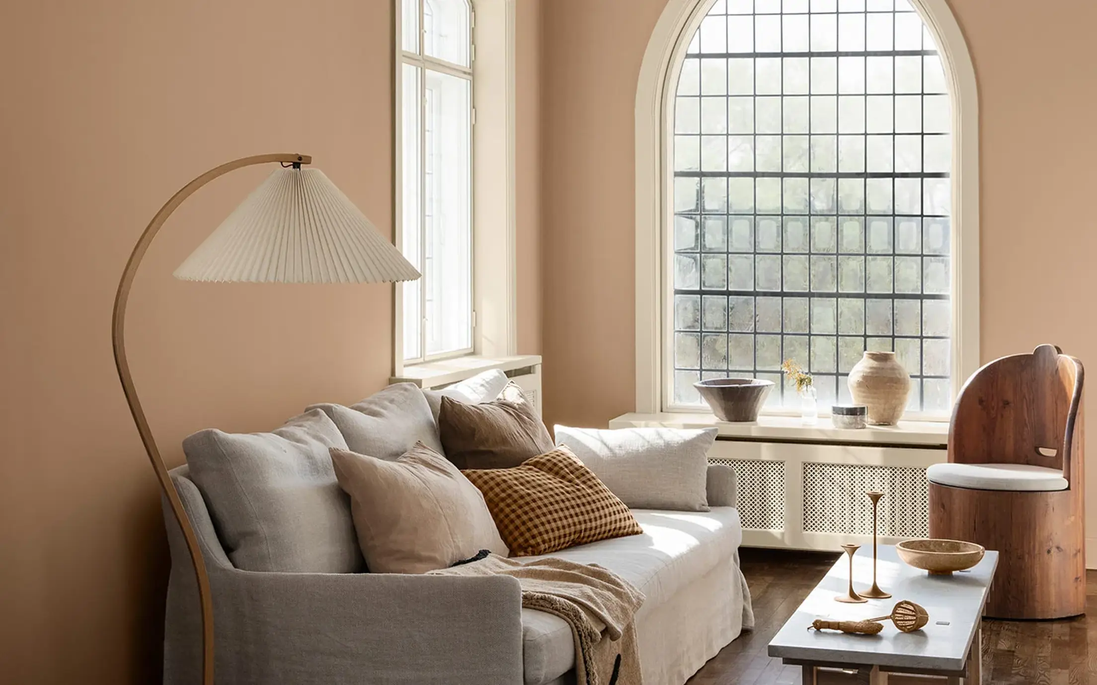
embraceA warm terracotta colour. An incredibly lovely, happy terracotta tone that encompasses the room. The perfect mix of pink and orange, bringing a feeling of positivity and warmth into the room.
1259
rustyA burnt, reddish-orange tone. LADY Rusty is a rustic terracotta tone able to bring joy and an earthy, natural atmosphere.
5516
iron blueA coarse blue-grey tone. This is an outstanding blue tone with a greyish expression, giving it a slightly coarse and industrial expression. It’s great on its own, but also makes an exciting contrast to a number of other hues.
7236
jazz whiteWhite, a colour of purity, suggests goodness and innocence. Its elusive nature provides a sense of serenity and the essence of perfection.
6383
imagineA bright, turquoise tone. This is a stunning turquoise tone, which is relatively pure and bright in its appearance.
6384
wishA bright, turquoise tone. 6384 Wish is a happy turquoise colour falling right between 6383 Imagine and 6084 Sea Emerald.
6084
sea emeraldTeal, a beautiful mix of blues and greens, takes the best qualities of each colour. It is versatile, and can be either striking or soothing depending on its application.
8565
hopeA lovely, bright green tone that can be described as springlike, lush and sharp. It’s actually a green tone that is much brighter than the subdued green tones we’ve seen in recent years.
0125
palm leafGreen, a colour of life, represents freshness and security. While it creates a restful atmosphere, it also possesses the intense power of nature.
20186
lavender touchA dusty tone of lavender. This is a greyish lavender tone, and a little cooler in its expression. Lavender is a key trend this season, and Lavender Touch is no exception.
10235
summer sunA lively yellow tone. This is a bright yellow tone able to fill the room with sunshine and positivity. Bringing yellow tones into the interior can feel like a shot of vitamins!
3377
slate lavenderA subdued purple nuance. The colour is greyish and a bit cool in appearance. Works well with cool grey nuances such as 9911 Platinum and 9930 Jazz Grey, but is also nice with warmer grey nuances such as 1032 Iron Grey, 1973 Objective, 1269 Dawn, 12077 Sheer Grey or 12078 Comfort Grey. Some people appreciate the combination lavender and green, and 7628 Treasure and 7629 Antique Green are nice alternatives.
1376
mistA warm greyish white
12180
presentA subdued, greige tone. This is a reddish subdued tone, able to bring warmth and softness to the room.
12181
soft comfortA warm grey-beige tone. This is a lovely soft subdued tone, able to combine the best from the grey and the brown.
12182
gentle whisperA light, greige tone. Gentle Whisper is a mellow, greige colour in which hints of beige and grey can be clearly seen. Undertones become clearer in lighter tones such as this.
20185
friendly pinkA dusty pink nuance. Kind and soothing.
20184
thoughtfulA rose-tinted earth tone. Caring and calming.
2011
antique brassA happy, peach pink tone. A lovely, positive and elegant peach pink tone. It can bring out the best in a subdued palette, or create its own atmosphere all on its own.
2040
light graniteA golden, pink tone. This is a livelier version of 10580 Soft Skin, but can also be described as lighter than 2024 Senses and more greyish than 2782 Deco Pink.
8281
pale lindenGrey is perceived as long-lasting and classic. It's an ideal background colour, and yet still carries authority. Grey also works well with flashy or colourful décor.
Jotun’s decorative paints are loved in many countries around the world. Select your region in the list below to see if our paints are available in your country.

Just as being in the same room as other people can spark new ideas and cheer us up, colour has the power to calm us down or fire us up, clear our minds or kick-start our creativity. At Jotun, we are fascinated by the way the shades we surround ourselves with shape our everyday lives.
This year, the colour themes we have created are each designed to reflect and intensify a different aspect of our individual identities and lifestyles, but they are all rooted in the universal human need to share time and space with others. We are meant to be together, after all.

Discover the colours for 2022 in our brochure.

Jotun's new colour collection for the 2025 season, Nuances, celebrates the impact of subtle shades.

From our clothes to our homes, the colours that we surround ourselves with are a reflection of who we are and how we want to feel. In tribute to the art and science of colour, Jotun presents 23 colours for 2024.

Stories collection 2023 is a selection of expressive, hopeful colours designed to inspire creative expression in our home decor.

Jotuns Rediscover collection is a range of earthy and timeless hues to minimalistic shades that have been carefully picked from our archives.

All our colours are developed with unique recipes specifically designed for Jotun products. Jotun guarantees correct colour rendering only with the use of Jotun's products and pigments. Please note that substrate, gloss, lighting conditions and other product finishes might influence the appearance of the colours. Due to variations in screen settings and operating systems, the colour that appears on your screen may not be the exact result of what you achieve. Digital colours are provided as a guide only.
A video is being shown
An image is being displayed
A brochure is being displayed