


Canvas collection 2024
Your home is your canvas
From our clothes to our homes, the colours that we surround ourselves with are a reflection of who we are and how we want to feel. In tribute to the art and science of colour, Jotun presents 23 colours for 2024.

Reflecting the beauty and nuances of nature’s own palette, this collection is designed to provide both aesthetic inspiration and practical insight.
Lisbeth Larsen
Global Colour Manager at Jotun
Reflecting the beauty and nuances of nature’s own palette, this collection is designed to provide both aesthetic inspiration and practical insight.
Lisbeth Larsen
Global Colour Manager at Jotun
Canvas Collection
1376
mistA warm greyish white
12075
soothing beigeA golden beige nuance. This colour may appear similar to the popular 1140 Sand, but it will appear slightly more subdued - a faint blackish veil will spread across the colour. The colour is perfect against darker brown nuances such as 10965 Hipster Brown, 1623 Marrakesh or 1929 Nutmeg. Among coloured tones, a subdued green will be a lovely combination, - check out 8252 Green Harmony, 8469 Green Leaf or 8494 Organic Green.
12290
antwerp beigeThis might be your new favorite beige colour! It is soft and warm. It will remind you of colours like 12075 Soothing Beige and 1623 Marrakesh / Persian Khaki. It’s elegant, beautiful and can be combined with a lot of neutrals and more colorful companions. White and beige, but also burnt red and orange.
12291
soft brownSoft Brown is a golden brown. It is much more yellow than the traditional warm, reddish brown. It will make a modern contrast combined with muted yellows, golden whites or golden peach tones.
1632
rock sugarRock Sugar is a modern, golden brown colour. It is distinct, and not like every other traditional brown colour. It is golden, warm and welcoming, - and it can really spice up a dull neutral colour scheme, when used with elegancy. Amazing combination with golden beige and soft yellow, but also a modern contrast to mix with the poplar cobolt blue tones as 4863 Statement Blue and 4947 True Blue.
9925
fahmSometimes you just need to cool things down, - add Fahm and play with its cooler depth and create contrasts. You can add Fahm to the cooler greige colours as well as the lighter neutrals as 9911 Platinum, 9915 Oxford River or mix with both cooler and brighter blues!
12078
comfort greyA warm grey nuance. 12078 Comfort Grey is a brighter version of the popular 0394 Soft Grey. This colour looks quite cool against contrasts such as the red tones 20120 Organic Red or 20118 Amber Red, check it also out against the darker green tone 7629 Antique Green. Blue tones such as 4618 Evening Light, 4638 Elegant Blue, 4477 Deco Blue and 4744 Sophisticated Blue works harmoniously with this grey nuance, as do the warm greys 12077 Sheer Grey, 1352 Form, 10429 Discrete, 10853 Velvet Grey and 10249 Vandyke Brown.
12077
sheer greyA bright, warm grey nuance. It is neither beige nor bluish grey, - rather more like a bright, cool mole nuance. 12077 Sheer Grey works perfectly against grey tones such as 10342 Sable Stone, but the reddish undertones also appear exciting for anyone wanting to pursue the red tones, in the form of the golden pink tones 20046 Savanna Sunset and 20047 Blushing Peach. Blue tones such as 4618 Evening Light, 4638 Elegant Blue, 4477 Deco Blue og 4744 Sophisticated Blue are gorgeous combinations, as are the more reddish blue tones like 4109 Gustivian Blue.
5081
silver moonGrey is perceived as long-lasting and classic. It's an ideal background colour, and yet still carries authority. Grey also works well with flashy or colourful décor.
4947
true blueYou can count on True Blue to bring an elegant punch to your interior. It is bold, but beautiful. Use it as a blue main character or as a vibrant side-kick to a more neutral colour palette. Cool grey, white, greige, golden brown mint and yellow are some of the beautiful combinations you should look into.
9918
classic whiteWhite, a colour of purity, suggests goodness and innocence. Its elusive nature provides a sense of serenity and the essence of perfection.
20218
healing lavenderIt is cool and muted, mysterious and calming. Lavender can be a good colour for bedrooms and areas in your home where you would like to have a calm, tranquil atmosphere. Combine it with pure and crisp neutrals or mix it up with a more vivid green to increase the playfulness.
2300
deep soilIs it reddish brown, or do you also see hints of purple hidden in this colour? Both is correct. That’s why this is a unique, mysterious colour to include in your home. Use it in room you seek a beautiful, moody atmosphere, - maybe to create a luxurious hotel suite inspired master bedroom?
2224
indi pinkIndi Pink is a soft, muted, golden pink. The softness makes it easygoing, and it will be a good basic pink to combine with a lot of colors, - both neutrals and more colorful editions as greens and reds. Indi Pink can be described as lighter, less golden version of 2024 Senses, - but also as a slightly pinker version of 2040 Light Granite.
20217
muted coralMuted Coral is an elegant, muted coral red. It will lift your golden neutrals to hole new level, and it will for sure make an excellent accent colour to many of Jotun’s most popular green shades. Combine it with white, beige, grey, peach and yellow!
1622
reflectionA slightly greyish white nuance. The colour has a reddish undertone, which will take many by surprise as it is barely visible at first sight. Soft and rustic reds, such as the new 12084 Dusky Peach, 12085 Rural, 20120 Organic Red and 2856 Warm Blush are great, warm combinations against 1622 Reflection.
1775
fresh pastaFresh pasta will bring sunshine and positive vibes into your interior. Fill up a whole room of rays or pick some playful details for an upgraded energy boost! It is fresh alone with whites, and very delightful in combination with green, lavender and orange.
7386
pistachioThis is a fresh, crisp green. It is playful, yet delicate. It can be described as a colour with a perfect combination of mint green and golden green. Compared to a well-known green as 8302 Laurel, Pistachio is livelier and more vibrant. It feels lush combined with pure whites, and more playful mixed with pink, peach, orange and yellow. It will bring energy to darker greenish blues as well!
7685
subtle greenThis is a calm, wonderful green colour, - a perfect choice for many rooms, kitchen, livingroom, bedroom, yoga room or a spot in your house where you would like to unwind and find some peace and quiet in your everyday life. Subtle Green has a lot of similarities with the popular 7628 Treasure.
7686
mindful greenMindful Green is a well-balanced, muted green tone. It is a perfect mix of blue and green. It can be described as a cooler version og 7629 Antique Green, but also as a slightly greener version of 6325 Balance. It will be smooth with both neutrals and greens with similar color hues, but also a fresh combination with purple, pink, orange or yellow.
8583
earthy yellowMuted yellows have the power of both lifting your spirit with its sunny vibes, as well as the muted tones will make the atmosphere soft and tender. Earthy Yellow is a golden, natural yellow colour with a light greenish hint hidden in the undertones. It will make golden green colors pop, but it is also wonderful to mix with other yellow colors from the same color family.
0288
mexicoIs it green or is it yellow? It is the best of both. It has an exciting, lush feeling to it, and it can be used to spark your energy. How about athe uplifting Mexico, in your entrance hall?
8493
green teaGreen, a colour of life, represents freshness and security. While it creates a restful atmosphere, it also possesses the intense power of nature.

Inspired by nature
Responding to a growing global trend for calming colours that help us relax, Jotun's 2024 palette includes a spectrum of nature-inspired greens, as well as fresh blues and soft greys that evoke the meditative shades of sky and sea. Earthy browns and beiges cultivate a sense of groundedness, whereas yellows and golds underpin the ambience with an uplifting touch of joy.

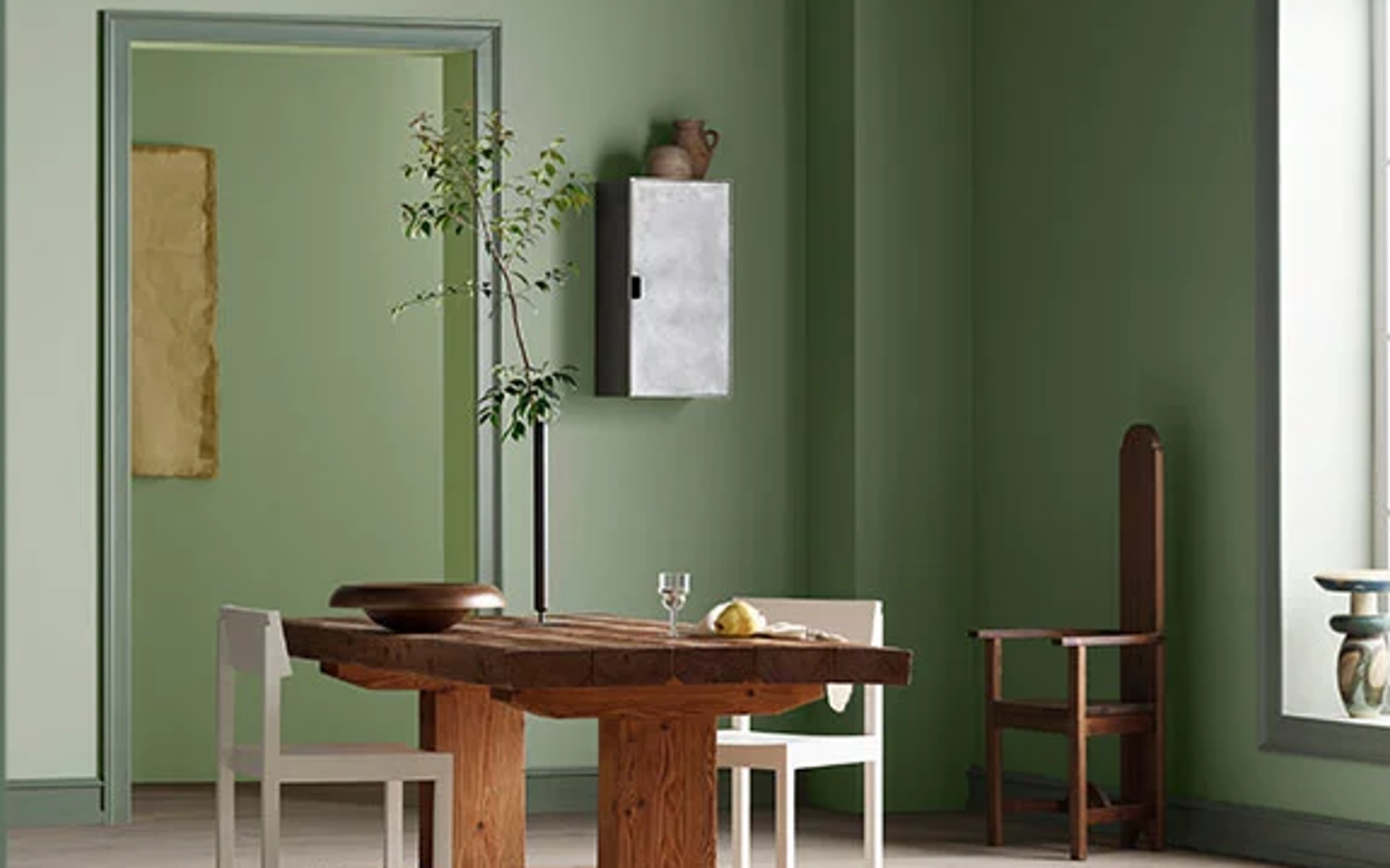
Green peace
The strong connection between nature and the green colour family perhaps explains why greens typically create calming atmospheres. With a palette of monochome colours rooted in nature, you can infuse an interior with the tranquility and inspiration of a forest glade.
Try out 1775 Fresh pasta as an accent colour
Imbue your home with a sense of serenity by borrowing a palette of layered greens from the natural world.

Let it glow
In the language of colour, yellow is synonymous with joy. Even in its most subtle expression, yellow cannot fail to bring an uplifting, energising influence to a room.

Warm and grounded
Soil and sand, shells and stones... Green is far from Nature's only colour of choice. Grounding earth tones. soulful yellows and warm red hues evoke the world's sublime landscapes of monutain and desert, realms of rock glowing gold with the sunrise.

Surface: Jotun 20217 Muted Coral

Try out 20217 Muted Coral as an accent colour
Touched with golden tones, colours such as Earthy Yellow, Mexico and Muted Coral are the cornerstones of rustic interior styles.

Under the pink
Use colours of the same hue but different levels of intensity - such as Jotun's new, gentle Indi Pink and the bolder Muted Coral - as base and accent colours to create interest, or deploy alongside neutrals like Soothing Beige to emphasise perspective.

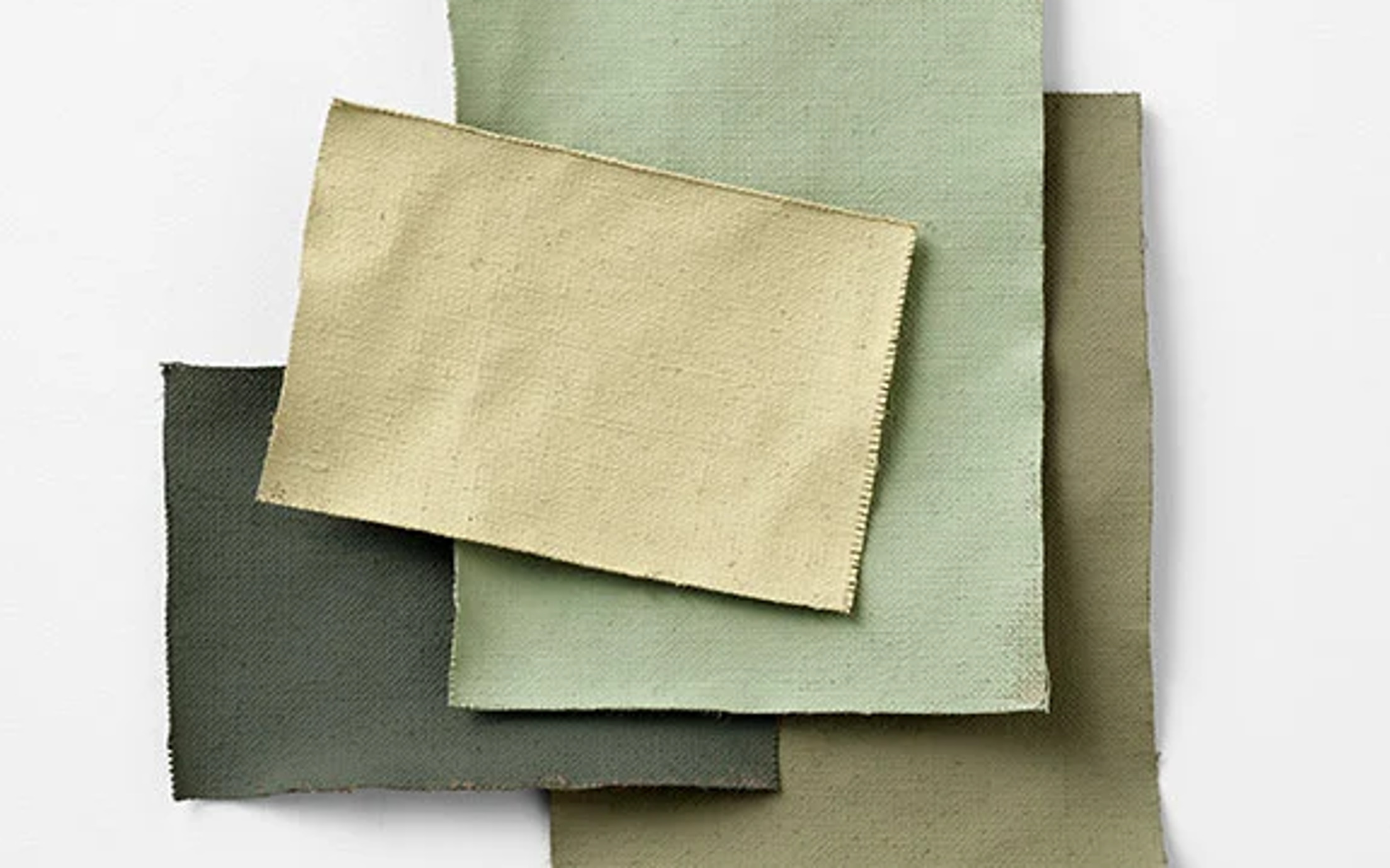
Beauty in brown
From the rich depths of Soft Brown to the caramel lightness of Rock Sugar and the flinty tranquility of Soothing Beige, Jotun's family of browns and beiges can be mixed and matched to create hugely nuanced interior schemes, radiating warmth and comfort.

A fine balance
The impact of an interior is often rooted in its neutrals. Timeless muted tones, ranging from golden beiges to stony greys, bring balance and harmony to the home. The natural foundation of any colour scheme, neutrals can be deployed to enhance the effect of stronger colours, or combined to create delicately layered, inherently relaxing spaces.

Wall: Jotun 12290 Antwerp-Beige

Mix and match the beautiful brown and beige colours

Into the blue
New for 2024, Jotun's True Blue is a powerful and pure blue that evokes natural landscapes of sky and sea. A perfect partner to crips whites, it demonstrates how, with bold colours, a little can go a long way.

Middle wall: Jotun 5081 Silver Moon

Add 4947 True Blue to stand out
Applying a fresh feature colour to just a single element can have a truly transformative effect on the look and feel of a space.

Explore our brochure
Give your home a makeover with our extensive range of premium products and beautiful colours.
Looking for more interior colours?
Jotun’s decorative paints are loved in many countries around the world. Select your region in the list below to see if our paints are available in your country.
Explore these collections

Nuances collection 2025
Jotun's new colour collection for the 2025 season, Nuances, celebrates the impact of subtle shades.

Stories collection 2023
Stories collection 2023 is a selection of expressive, hopeful colours designed to inspire creative expression in our home decor.

Together collection 2022
Jotuns Together collection is a range of newly developed colours complemented by timeless hues. The 28 shades are designed to be mixed and matched to create interiors that relax, energise, and inspire.

Rediscover collection 2021
Jotuns Rediscover collection is a range of earthy and timeless hues to minimalistic shades that have been carefully picked from our archives.

Colour assurance
All our colours are developed with unique recipes specifically designed for Jotun products. Jotun guarantees correct colour rendering only with the use of Jotun's products and pigments. Please note that substrate, gloss, lighting conditions and other product finishes might influence the appearance of the colours. Due to variations in screen settings and operating systems, the colour that appears on your screen may not be the exact result of what you achieve. Digital colours are provided as a guide only.
Contact us
Would you like further advice for colours and products on your project? Please leave your contact details here and we’ll get in touch.