


Nuances collection 2025
Jotun's new colour collection for the 2025 season, Nuances, celebrates the impact of subtle shades.
 Global site

At Jotun, we have been creating colours for nearly 60 years. Our library spans thousands of hues, each with a story to tell. In the past, our annual colour card has showcased our newly created tones and shades for the home. This year, however, we rediscover.
Some of the colours in these pages are new. But many have been carefully picked from our archives – timelessly inspiring hues that can be called on to tell new stories in our homes. We have grouped these colours into four families – four stories if you like – but this is not intended to be prescriptive. Our home, like our life, is what we make it. And no matter the colours we choose, the truly considered home never goes out of style.

Discover the colour trends of 2021 through four distinctive themes. From earthy hues to minimalistic shades, every theme has a story to tell. Explore all four and find the colours that best express you.
12118
hummusA pale, warm yellow tone. This is a pale yellow tone that comes across as warm and accommodating. It is muted, lovely and elegant.
1392
antique yellowA warm yellow tone. This is a warm yellow tone that is accommodating and lovely.
10428
masalaA strong, clear ochre-yellow tone. This is a colour that immediately makes you think of fragrant spices and food from southerly regions.
12120
desert pinkA golden pink tone. This colour can also be described as a peach tone, as it has clear golden undertones in the pink.
12124
natural clayA burnt orange tone. This is a muted but cheery orange tone.
20167
welcoming redA golden red tone. This is a gentle, pleasant red tone with a hint of pink.
12127
earthy brownA dark, golden brown tone. This is a brown tone with obvious yellow undertones.
0486
early rainWhite, a colour of purity, suggests goodness and innocence. Its elusive nature provides a sense of serenity and the essence of perfection.
1276
softA muted, golden beige tone. This is a good beige tone that works really well as a base colour.
1563
lucerneA muted beige tone. This colour is a muted beige tone with a golden undertone. This is not as warm and rounded as traditional beige tones, but it looks slightly more greyish.
1288
grand shadowA muted, greenish beige tone. This is a colour that will come across as a mix of beige, yellow and green.
10385
belgian brownA muted, golden brown tone. This is a fairly dark, greyish brown tone that comes across as warm and lovely.
12125
impressionA golden brown tone. This is a golden brown tone with clear hints of brown. It's exciting when teamed with a range of colours.
1303
observeA yellow-beige tone. This is a yellowish beige tone that will come across as far more golden than traditional beige tones. It fits in somewhere between beige and yellow.
5504
coastal blueA muted blue tone. Pleasant, calm and slightly greenish in undertone.
5503
natural blueA muted, calm blue tone. A soothing blue medium tone, discreet and timeless. This is a paler version of blue tone 5504 Coastal Blue.
4894
ocean airA muted, paler blue tone. This medium tone has a lovely hint of grey, and it could be described as both calm and timeless. It will work well in bedrooms, living rooms and kitchens, as well as in children’s rooms.
10963
golden bronzeBrown is a warm and woody colour that grabs attention. It's an essential colour of nature that symbolizes ease and contentment.
8469
green leafGreen, a colour of life, represents freshness and security. While it creates a restful atmosphere, it also possesses the intense power of nature.
1973
objectiveGrey is perceived as long-lasting and classic. It's an ideal background colour, and yet still carries authority. Grey also works well with flashy or colourful décor.
1024
timelessWhite, a colour of purity, suggests goodness and innocence. Its elusive nature provides a sense of serenity and the essence of perfection.
12123
contemporary whiteA golden, whitish tone. This is a yellowish white tone, and compared with the well-known 1001 Egg White and 1453 Cotton Ball, it is obviously slightly darker and slightly more yellow.
6379
cityscapeA muted mint tone. This is a greyish, blue-green tone often known as mint.
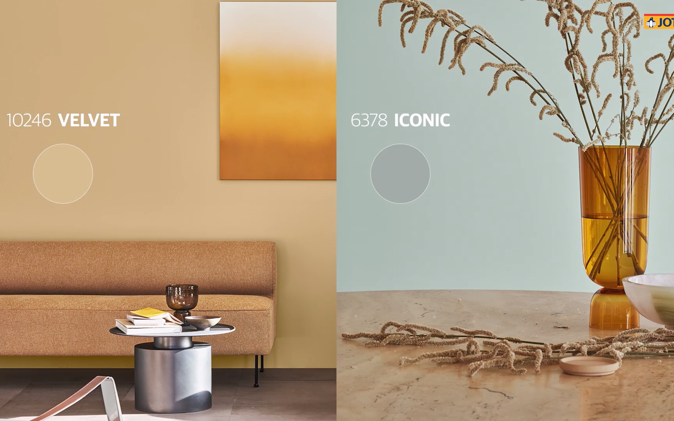
6378
iconicA muted mint tone. This is a greyish, blue-green tone often known as mint.
8118
crispA pale green tone. This is a pale, spring-like green tone with golden undertones. It is cool and easygoing.
12126
silhouetteA muted greyish-yellow tone. This exciting, grey-yellow tone can be described as a paler version of 11174 Curious Mind and 10961 Raw Canvas, albeing slightly less reddish in terms of its undertone.
10246
velvetA muted yellow tone. 10246 Velvet is a warm, muted yet clear yellow tone.
12119
vintage brownA muted brown tone. This is a warm, slightly greyish brown tone.
20162
mellowA red-brown tone. This is a mix of red and brown, but you could also call it a muted plum colour.
Jotun’s decorative paints are loved in many countries around the world. Select your region in the list below to see if our paints are available in your country.

Give your home a makeover with colours from Jotun's 2021 collection.
Jotun's new colour collection for the 2025 season, Nuances, celebrates the impact of subtle shades.

From our clothes to our homes, the colours that we surround ourselves with are a reflection of who we are and how we want to feel. In tribute to the art and science of colour, Jotun presents 23 colours for 2024.

Stories collection 2023 is a selection of expressive, hopeful colours designed to inspire creative expression in our home decor.

Jotuns Together collection is a range of newly developed colours complemented by timeless hues. The 28 shades are designed to be mixed and matched to create interiors that relax, energise, and inspire.

All our colours are developed with unique recipes specifically designed for Jotun products. Jotun guarantees correct colour rendering only with the use of Jotun's products and pigments. Please note that substrate, gloss, lighting conditions and other product finishes might influence the appearance of the colours. Due to variations in screen settings and operating systems, the colour that appears on your screen may not be the exact result of what you achieve. Digital colours are provided as a guide only.
A video is being shown
An image is being displayed
A brochure is being displayed